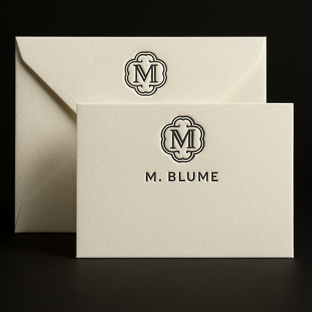
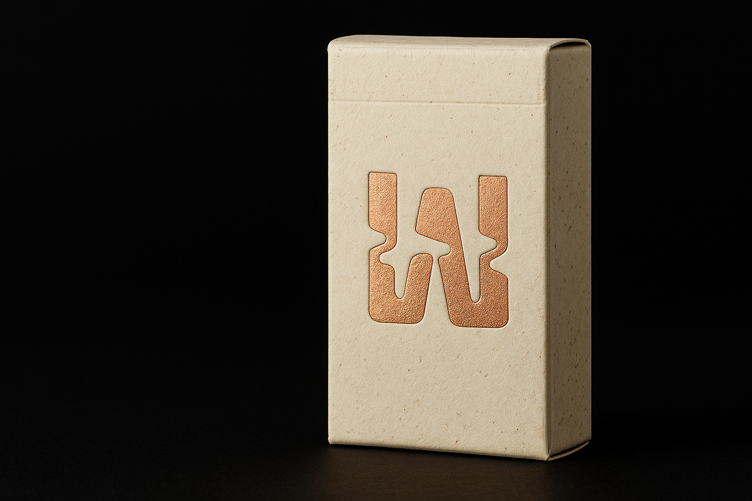
Home/Case Studies/
Fine-Art Prints

Julian Rafí — Sculpted Minimalism in Gold

Hot Foil Stamping, Custom Die-Cutting, Materials Consultation

Where refined typography meets crafted metal shine.


For LA-based creative director Julian Rafí, we developed an identity system that balances restraint with richness—every element shaped to feel timeless, tactile, and unmistakably premium.

THE CLIENT & THE BRIEF

Luxury rooted in restraint

Julian Rafí is known for his quiet, architectural approach to branding—slow visuals, intentional spacing, and an obsession with form. He approached WYLD seeking a printed identity system that felt sculptural, not decorative.

His brief was simple:
“Minimal, but with weight.”

Our challenge was to translate his understated digital aesthetic into something tactile—an object of presence—using only pure typography, rich materials, and foil.

  • The Challenge

    How do you make minimalism feel monumental?

    Minimalist design relies on subtlety. But subtlety is notoriously hard to print. Every decision—paper weight, foil temperature, pressure depth—becomes amplified.

    The goal:

    • No color.
    • No illustration.
    • No textured patterns.
    • Only form, light, and material.

    Every micro-detail would determine whether this brand felt lifeless… or alive.

  • The Solution

    A sculptural approach to minimalism

    We designed a system built entirely on contrast—light against shadow, softness against metallic precision. The identity leans on:

    • 600gsm museum-grade cotton stock
      To create physical depth without noise.
    • Matte gold hot foil
      For a warm, diffused glow instead of a brassy shine.
    • Oversized die-cut proportions
      Creating a frame-like presence in hand.
    • Tight kerning + architectural typography
      Supporting the client’s design philosophy.

    The result: minimalism that feels carved, not printed.

Textured sheet chosen for tactile presence
An illustrated card in natural packaging on burlap and newspaper background, artistic and cozy.

Tagline

Lorem ipsum dolor sit amet, consectetur adipiscing

Techniques:
Hot Foil Stamping (Matte Gold), Deep Deboss
Material:
100% Cotton (600gsm, Bright White)
Foil / Ink Colors:
Matte
/
Gold 873
GSM / Thickness:
lorem ipsum
Print Size:
2" × 3.5"
Finishing:
Debossed logomark, foil-stamped typography, soft edges
Turnaround:
10 business days
Quantity:
500 units

Testimonial

Lorem ipsum dolor sit amet 

Lorem ipsum dolor sit amet, consectetur adipiscing elit, sed do eiusmod tempor incididunt.

What is Lorem Ipsum?

There are many variations of passages of Lorem Ipsum available, but the majority have suffered alteration in some form, by injected humour, or randomised words which don’t look even slightly believable. If you are going to use a passage of Lorem Ipsum, you need to be sure there isn’t anything embarrassing hidden in the middle…

Julian Rafí
Creative Director

Where can I get some?

WYLD understood exactly how to translate silence and minimalism into something physical and powerful. The cards feel like small art objects. They truly exceeded every expectation.

Julian Rafí
Creative Director

Where does it come from?

Contrary to popular belief, Lorem Ipsum is not simply random text. It has roots in a piece of classical Latin literature from 45 BC, making it over 2000 years old. Richard McClintock, a Latin professor at Hampden-Sydney College in Virginia, looked up one of the more obscure Latin words, consectetur, from a Lorem Ipsum passage,…

Julian Rafí
Creative Director

Why do we use it?

It is a long established fact that a reader will be distracted by the readable content of a page when looking at its layout. The point of using Lorem Ipsum is that it has a more-or-less normal distribution of letters, as opposed to using ‘Content here, content here’, making it look like readable English.

Julian Rafí
Creative Director

Tagline

A sculptural approach to minimalism

The identity system is built on three core principles:

  • Precision

    Every millimeter matters. Tight radiuses, clean spacing, and exact plate alignment ensure the identity feels expertly engineered.

  • Tactility as Branding

    By leaning into cotton stock, the brand gains a softness—an invitation to touch, hold, and explore.

  • Light as Storytelling

    The matte gold foil reflects differently throughout the day, giving the brand a living, breathing quality.

Letterpress precision

  • Deep deboss achieved using 2× pressure cycles
  • Custom magnesium plate for ultra-fine type fidelity
  • Hand-fed sheets ensure no fiber burn or foil bleed

Foil execution

  • Matte gold foil at 320°F
  • Slow dwell time for velvety adhesion
  • Edge-to-edge consistency across 400+ units

Material selection

  • 600gsm 100% cotton
  • Acid-free archival construction
  • Made in Italy

Finishing

  • Hand-trimmed to non-standard proportion
  • Soft-touch edge sanding
  • Microfibre dust removal before packing

RECOMMENDED TECHNIQUES

Lorem ipsum dolor sit amet

Lorem ipsum dolor sit amet, consectetur adipiscing elit, sed do eiusmod tempor incididunt.

View all techniques

RECOMMENDED MATERIALS

Lorem Ipsum is simply dummy text

Lorem ipsum dolor sit amet, consectetur adipiscing elit.

View all Materials

RELATED CASE STUDIES

Lorem ipsum dolor sit amet

Lorem ipsum dolor sit amet, consectetur adipiscing elit, sed do eiusmod tempor incididunt.

View all
View all case studies

Guides & Insights

Lorem ipsum dolor sit amet

Lorem ipsum dolor sit amet, consectetur adipiscing elit, sed do eiusmod tempor incididunt.

Tagline

Ready to create something unforgettable?

Tell us what you’re working on — we’ll recommend the perfect materials, techniques, and pricing.